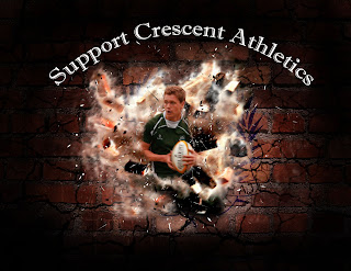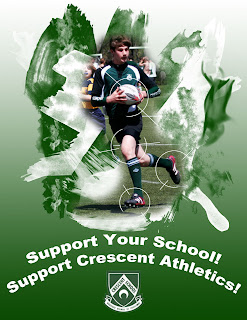

My favourite poster of the two I designed was the second one, in which Jack Hogarth, a senior rugby player, is seen breaking through a brick wall. I think that it both looked better and was a better demonstration of the skills I have in Photoshop. It used the pop art effect we learnt, multiple methods of selection, feathering techniques (both the feather tool and “soft” erasers), techniques for warping pictures, transforming pictures, and layer masks. Combining all these techniques created a great poster, and one that I am proud to submit as part of my final summative.
The poster utilized skills we learnt during this course, as well as some skills I learnt during the media arts section of the Grade 9 tech course. I created my own brushes, using brush presets. I used magnetic lasso to isolate Jack. Using adjustments in contrast and colour, I was able to make photos look darker and more intense. I warped pictures of bricks to add dimension to the poster, and used shards of glass to add another aspect. I used feather and eraser brushes to add the dark border. I used the overlay effect to add both the cracks and the UCC logo on the wall. I used the eraser tool to clean up the poster, and then added text to convey the message of my poster. Layer mask allowed me to make the photo more realistic, as I could place some of the background over Jack.
In both posters I created, I only had a short lines of text. The majority of the poster was the images, which in my opinion were able to convey the message of my PSA. I used school colour themes as much as possible. I tried to apply the rule of thirds as much as possible, and create an attractive poster that captures the viewer’s attention. I asked for critique from fellow students, and made sure that the poster’s features could be distinguished from a distance.


